Why Do You Need a Custom Header? #
PathPro allows you to add a custom header to any of your projects. Why, you might ask? Well, one of the main features setting PathPro apart is that you can place a “front facing: view of your projects so your customers can view and interact. This means customers will be able to view your public roadmap, so they can know what’s coming next, but they’ll also be able to join your project to interact, such as voting on potential features, adding suggestions to tasks in the works, and more.
By adding a custom header, you’ll simply add your project link directly into your site’s navigation. This means your customers will have a seamless experience directly on your public website. In this documentation we’ll explain exactly how to recreate your site’s header and how to implement it into your site.
Accessing the Custom Header Settings #
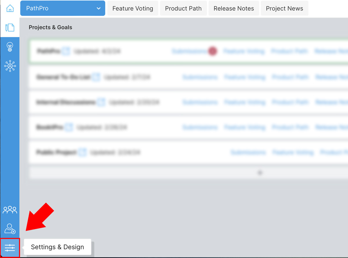
The customer header settings can be found by clicking on the “Settings and Design” tab in the lower left of your admin area , as shown here:
On clicking through, you’ll then see the header settings. Note that if you have not selected a project in your project dropdown, you will see the following default message:

So, as it explains, you’ll need to select the Project from the dropdown menu in order to edit that specific Project’s header settings. After selecting a project, you’ll then be able to edit the settings, as we’ll explain in detail in the next section.
Custom Header Settings Overview #
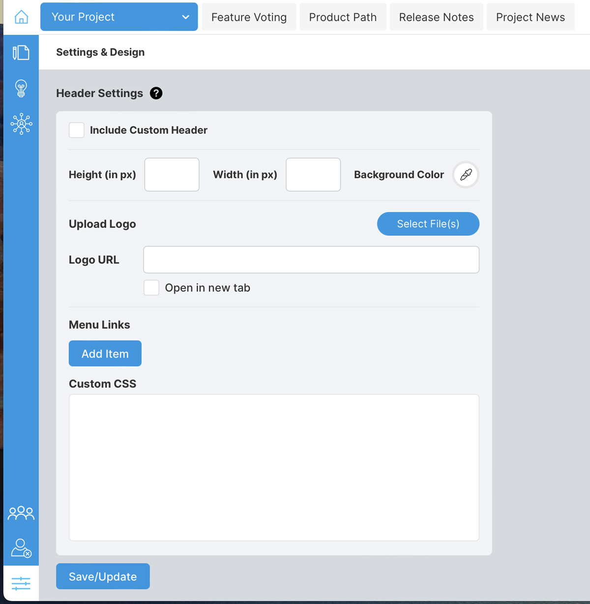
Below is a breakdown of each feature of the custom header settings. Note that we’ll go into depth for each setting in the next section as we walk you through building a custom header, but this will outline the basics:
Include Custom Header: Select this option to enable the header. This will place the header above all of your “Front-Facing” content accessible by your community. We recommend leaving this off until your header is complete, though you can toggle it on and off to preview your header as you build it.
Height/Width/Background Color: These settings relate directly to the background size and color of your header. Enter the height and width as needed (in pixels), and click the eye dropper icon to choose a background color. Note that with the width setting, this relates to the content of the header, not the width of the background, which is always fullscreen. You can leave the width settings blank for a 100% width header content.
Upload Logo: You may upload a logo for your website here. This would be the exact same logo you use on the site where you want to present your PathPro project to your community. Note that the logo will display at the exact resolution of the file itself without adding additional CSS (which we’ll cover later).
Logo URL: Enter the URL/link where users will go when clicking the logo. Typically this is your site’s main domain.
Menu Links: This is where you’ll add the actual navigation links. You may also add a CSS class for styling the links and creating buttons, which we’ll cover in the CSS section.
Custom CSS: You’ll most likely need to add custom CSS to get your menu looking just like the one featured on your website, and this is where you can do so. We’ll cover this in depth in later sections, as well as outlining the custom CSS classes we’ve included to help you style your header.
Creating Your Custom Header #
Creating your header involves a combination of entering details on size, uploading your logo, adding the links, and then customizing your CSS. To keep things simple, we’re showing you exactly how we’ve created the header for PathPro’s front-facing view. As you’ll see, this header mimics the header on the actual website. To compare, you can go to our demo, which features a custom header:
View Our Live Demo to Preview our Custom Header
You can simply click on any link there, such as the Pricing or Contact Us links, and you’ll see that the website’s header is the same. So, we’ve created a seamless experience that allows visitors to jump back and forth from your site to your project in a seamless manner. Let’s breakdown how we created the menu in the custom header settings, keeping in mind that we’ll be building a header that looks like this (marked by the red outline, which of course is not included in the actual header):

So, as a general practice you’ll do the following:
- Set your height, width, and background color
- Upload your logo and enter your home page URL
- Add all of your navigation links and buttons, adding CSS Classes for buttons
- Edit the custom CSS to customize all of your header’s style details.
- Enable the header
Let’s cover each setting in detail in the next section!
Basic Settings: #
Set height, content width, and background color:
First, we enter the height (75px). We leave the width blank because we want the content to span the full width, and we set the color to white using the dropper icon.
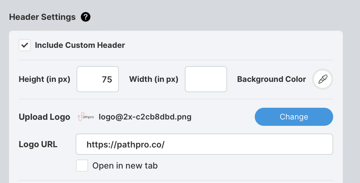
Upload logo and set URL:
As shown above, we’ve also uploaded our logo, and set the URL to our home page. You’ll want to add your own based on the header you are trying to create. Note that the logo will always display in the left portion of the header unless you alter the CSS.
Adding Navigation Links and Buttons #
This step adds all of the links featured on our site. Note that we have a few “normal” text-based links, and 2 buttons. First, let’s look at the expanded settings when adding a new link:
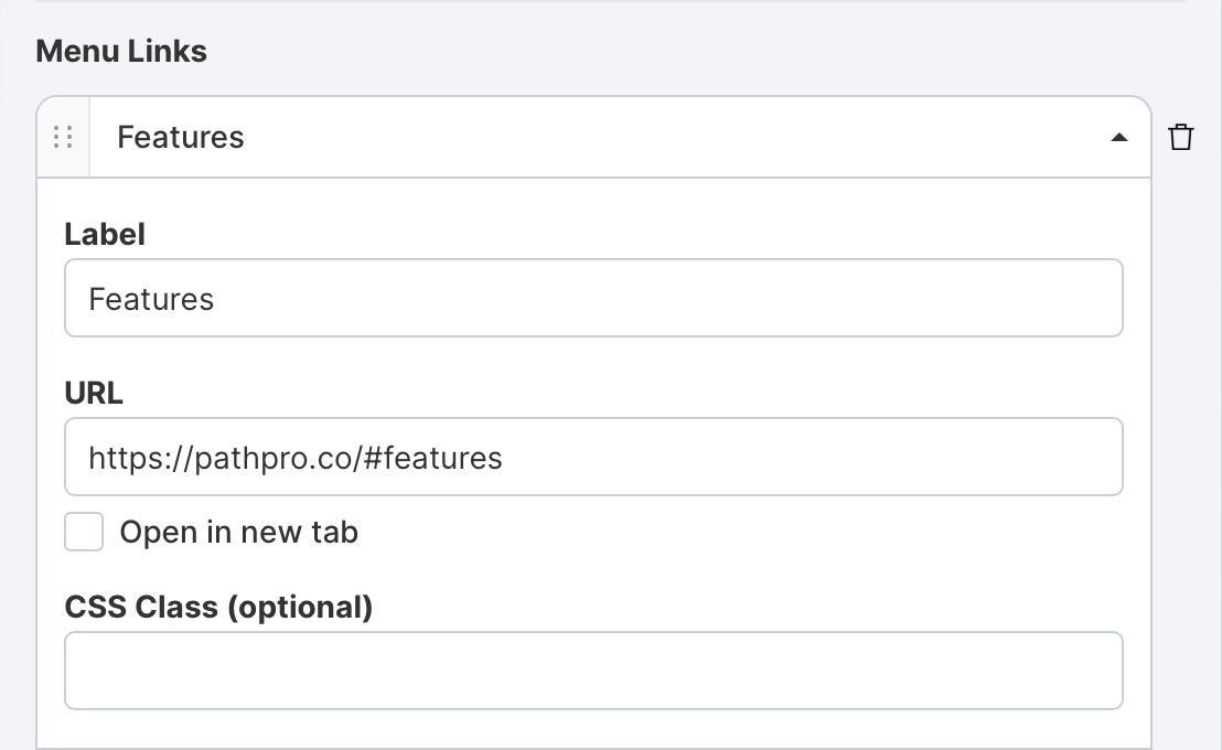
As you can see above, you can set the links title (Label) URL (the page you wish to link to), whether it will open in a new tab, and the CSS Class.
What is the CSS Class?
Good question: A CSS class lets you specify which CSS setting is to be applied to any given menu item. For text-base links, you’ll want to leave this blank as those CSS settings are handled in a custom CSS class (more on that later), but if you’d like to create a button, you’ll want to apply a CSS class here. For PathPro, we have 2 custom buttons, so let’s cover how we’ve styled those below, where we’ve opened the settings for that specific link/button:
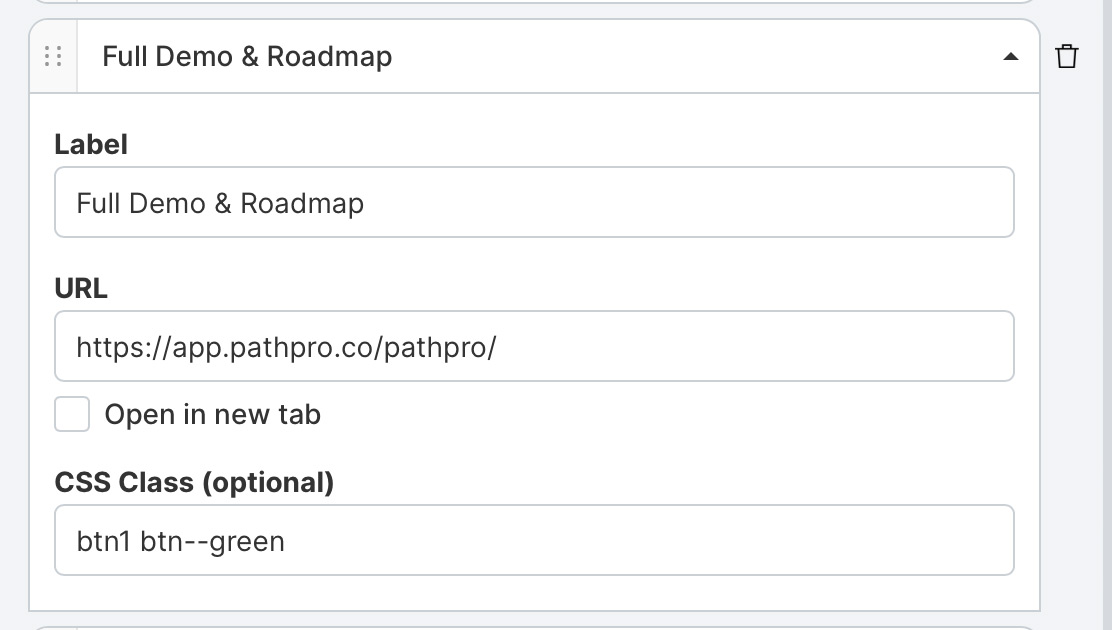
The above setting applies to the blue/green button shown in our menu below titled “Full Demo and Roadmap”:

So, you’ll note we’ve added 2 CSS classes to this link: “btn1” and “btn–green”. This is because “btn1” class can apply to multiple buttons to maintain consistency, but I want to add specific style choices to this specific button, and that’s where the second class, “btn–green” comes in. Note that adding this class is of course not enough to style the button, it simply tells this link where to look in the custom CSS settings, so let’s cover that next.
Note that while CSS editing is considered advanced, we’ve included steps below that should make it quite simple to create and customize your own header.
Creating a Button via CSS: #
Now that we’ve created a link and added a corresponding CSS Class (2 in this case), we’ll add the following CSS to the Custom CSS field. First, we’ll add the base CSS for all buttons, titled btn1. It’ll look like this:
.btn1 {

padding: 8px 16px;

border: 1px solid #000;

border-radius: 4px;

color: #fff;

text-decoration: none;

transition: color, background-color;

transition-duration: .4s;

}
We won’t go too in depth with CSS, but the above is a pretty solid set of CSS settings used to create a button. We’ve established the size, the padding, added rounded corners, set the color of the text, and added a light fade-in transition. Note however that we need some specific details, such as what happens on hover, so we’ll add the following, which tells the buttons to fade a bit on hover:
.btn1:hover {

background: rgba(255, 255, 255, 0.8);

}
Lastly, since we’ll have two buttons, we’ll want to add a class specific to this button only, and you’ll remember we titled this class “btn–green”, and it simply allows us to specify a color for this button only, while allowing us to style other buttons with the same basic settings:
.btn--green {

background: #59a0b0;

border-color: #59a0b0;

}
We also set the hover status using the “:hover” addition to the class (note this must exist as a duplicate CSS Class):
.btn--green:hover {

color: #59a0b0;

}
On clicking save (and after enabling the header), you’ll see that you now have a fully functioning, fully styled button!
As mentioned, we won’t go into detail on the vast potential of CSS customization as that would require an entirely separate article, but the CSS field allows nearly limitless possibilities of perfecting your header styles. To help you get started, we are including all CSS used to create the official PathPro header in the next section, starting with a breakdown of CSS Classes created solely for the PathPro header settings:
PathPro Specific CSS Classes and Their Function: #
Warning! Adding CSS beyond what you see below may cause conflicts within your project. We recommend you only use the follow CSS classes as they cover all aspects of building a custom header.
.project-header: This applies to the core header settings, and can be used to alter padding, drop shadows, fonts, and so on. See this as the core CSS Class, and one you’ll need to alter to perfect your header’s main details. If you look at ours, you’ll see that we’ve used this as follows:
.project-header {

padding-block: 8px;

padding-inline: 25px;

box-shadow: 0 0 5px #00000014;

margin-bottom: 5px;

font-family: Poppins, sans-serif;

}
Note that you can also add extensions to this main Class to alter specific details, for example:
.project-header__logo img: This class lets you set the size of your logo image. Since we recommend uploading a logo that is 2X its actual resolution 9for high-resolution displays) you’ll use this setting to force the default size while ensuring the image is crisp. Ours looks like this:
.project-header__logo img {

width: 115px;

height: 59px;

}
project-header__menu-links: Use this to style the default links in your navigation. First, we set some basics, which we highly recommend you adding also:
.project-header__menu-links a {

text-decoration: none;

transition: color 0.4s;

font-weight: 300;

}
Next, we added a a color to the hover status for better visual feedback to the user by adding “a:hover” to the Class:
.project-header__menu-links a:hover {

color: #f7665e;

}
.toggle-project-header-nav: This class let’s you change the color of the “hamburger menu” that appears on the mobile/tablet variation of your menu. For example you can set the color of the menu using this class:
.toggle-project-header-nav: {

color: #f7665e;

}
That covers it for the PathPro-specfic CSS classes! However, before wrapping up this article, let’s cover a couple other important, common elements.
Ensuring Your Custom Header Menu is Responsive: #
To ensure that your menu/header displays correctly on all devices, you’ll need to add the following CSS. Note this is common CSS elements to establish when the page will display in mobile-mode vs. desktop mode:
@media (max-width: 1023px) {

.project-header{

padding-inline:25px

}
@media (max-width: 767px),screen and (max-width: 812px) and (orientation: landscape) {
Adding Custom Fonts to Header: #
You can add your website’s custom fonts by importing them via CSS, and specifying which font should be used for your links and/or buttons as needed. First, you’ll want to use the @import option to specify which font your’e using. In our case, we use the “Poppins” google font, therefore the import snippet looks like this, telling PathPro where to “grab” the font files:
@import url('https://fonts.googleapis.com/css2?family=Poppins:ital,wght@0,400;0,700;0,900;1,400;1,700;1,900&display=swap');
You’ll then need to include the font in your CSS by adding “font-family: Poppins, sans-serif; to the appropriate CSS Classes. In our case we added this to the core .project-header class (which applies to all text-based links) and the .btn1 class, which applies the fonts to the buttons.
That covers all of the core elements! If you’re proficient in CSS, we’re sure this is all basic knowledge, but for those of you unfamiliar with CSS, we’ve includes all of our CSS in the next section for copying/pasting goodness.
A Breakdown of all CSS Classes #
Below you’ll find all of the custom CSS we’ve added to customize our header. Feel free to copy and paste any element that applies to your own header, and change as needed:
@import url('https://fonts.googleapis.com/css2?family=Poppins:ital,wght@0,400;0,700;0,900;1,400;1,700;1,900&display=swap');
.project-header {

padding-block: 8px;

padding-inline: 25px;

box-shadow: 0 0 5px #00000014;

margin-bottom: 5px;

font-family: Poppins, sans-serif;

}
@media (max-width: 1023px) {

.project-header{

padding-inline:25px

}
@media (max-width: 767px),screen and (max-width: 812px) and (orientation: landscape) {
.project-header{

padding-inline:15px

}
.project-header__logo img {

width: 115px;

height: 59px;

}
.project-header__menu-links a {

text-decoration: none;

transition: color 0.4s;

font-weight: 300;

}
.project-header__menu-links a:hover {

color: #f7665e;

}
.btn1 {

padding: 8px 16px;

border: 1px solid #000;

border-radius: 4px;

color: #fff;

margin-right: -10px !important;

text-decoration: none;

transition: color, background-color;

transition-duration: .4s;

}
.btn1:hover {

background: rgba(255, 255, 255, 0.8);

}
.btn--green {

background: #59a0b0;

border-color: #59a0b0;

}
.btn--green:hover {

color: #59a0b0;

}
.btn--orange {

background: #f7665e;

border-color: #f7665e;

}
.btn--orange:hover {

color: #f7665e;

}
.toggle-project-header-nav: {

color: #f7665e;

}
How to Add Your Project to Your Site #
By this point you’ve created and customized your header to perfectly match the one on your site. The only thing left to do is to integrate it into your actual website, and that’s done simply by placing the link to your project as a link wherever you want it to appear.
We typically suggest calling your front-facing view a “Product Path” as this captures the overall goal of PathPro’s front-facing portion. However it’s totally up to you how you’d like to integrate it, whether you’d like to have separate links for the Feature Voting vs. your Roadmap, and so on. In our official example, we title the page “Demo and Roadmap” as we are not only using PathPro as a demo for our customers, but we also use it in practice to gather data form our customers!
In any case, On our main site we’ve added the link to PathPro’s official project to the “Demo and Product Path” button. This way, when someone clicks on it, they are taken to the PathPro project itself, but, since the header you just created is identical to the one on your site, there is a seamless feeling that it is fully integrated/hosted within your site.
Where is my Project Link?
Your project link is typically formatted as such: https://app.pathpro.co/your-project-title
You can find it in the URL section of your browser when editing any of your projects, and you’ll want to copy that link to embed in your site. As mentioned, you’ll simply apply the link where necessary in a custom menu builder within your site, or within the HTML itself (this all depends on what platform your site was built on). For example, here’s where you would place the link in a WordPress site, under the Menu settings:
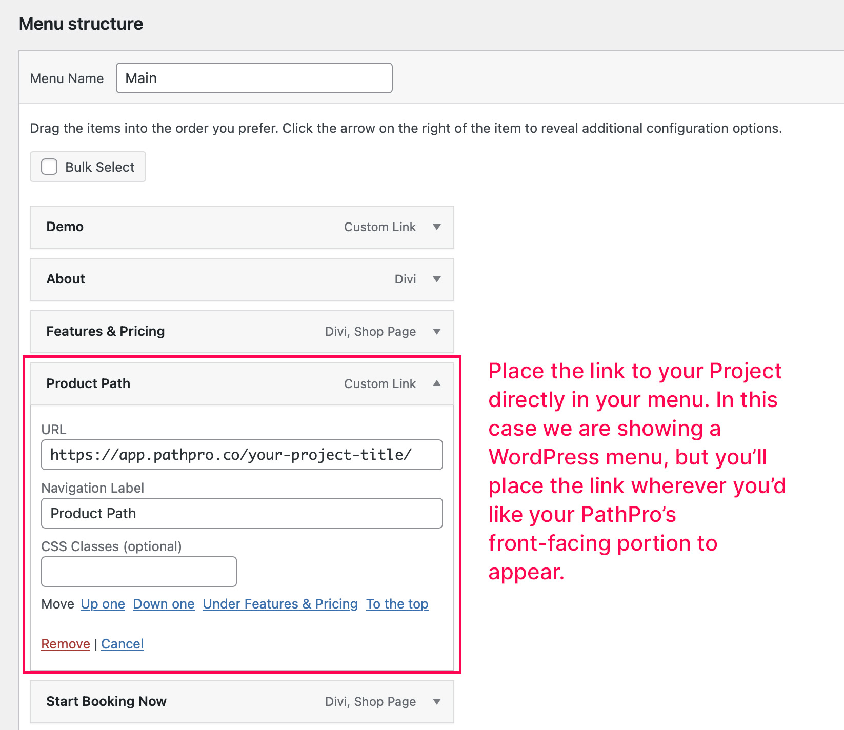
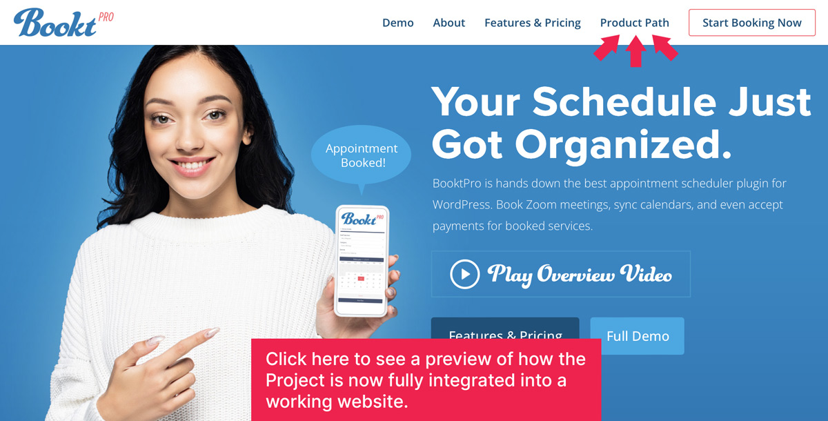
You can see how this works on PathPro’s official site of course, but you can also see another example from one of PathPro’s customers, BooktPro, who has also integrated their menu in this exact manner. You can preview how this works by visiting their site and clicking the “Product Path” link in their header. If you pay close attention, you’ll note how it is actually jumping back and forth between their website, and the PathPro project itself when you click between “Product Path” and any other link in the header.
That brings this article to a close, and we hope this helps you in creating your custom header!
